Using the AI Builder
Use the AI builder to shape an elegant, on-brand portal experience—layout, visual polish, and how pages feel—not only the underlying data. Work happens in threads in the builder panel: start a new thread, describe what you want, and iterate until the portal feels right.
Plan, Design, and Build modes control what the agent can change after your portal is built. Read how each mode works.
Where you work
The AI builder lives in the left sidebar — start a thread from New thread or pick one under Threads. Your messages, the agent's replies, and any tool work stay in that conversation. Your portal opens in the main preview panel with Preview, Code, and Plans tabs above the live preview.
On the Agents tab, the portal preview moves to a slide-out panel on the right so you can tune agents without losing sight of the customer UI.
Starting threads
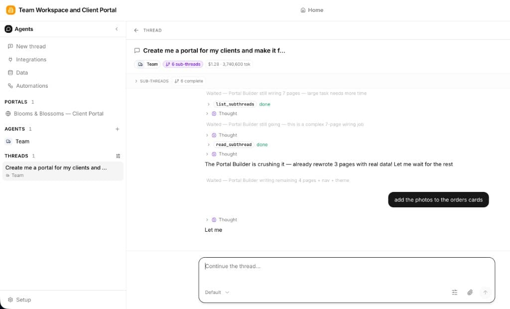
A thread is one conversation with the portal builder agent — the same model as starting threads with worker agents, but scoped to building and refining your portal. You need a thread to make portal changes — the agent edits pages, layout, and branding through the conversation, not from the preview alone.
Click New thread in the sidebar to start a fresh conversation, or open an existing one under Threads. Each thread keeps its own message history — your prompts, the agent's replies, tool work, and any sub-threads — so you can run separate builds or explorations in parallel.
If your app has multiple portals, name the one you want in your first message (e.g. "On the customer portal, redesign the home page") or open that portal's tab before you start — otherwise the agent updates whichever portal is active. See Multiple portals per app.
You can keep multiple threads per app — for example, one thread exploring a redesign in Plan mode and another implementing approved changes in Build mode. Only one thread can be actively generating at a time; while the agent is working, other threads are read-only until it finishes.
How the AI Builder Works
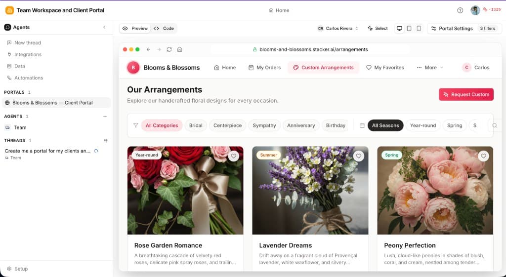
You describe what you want in plain language—in the active builder thread. Lead with the experience: how the portal should look and feel, what a great first impression is, and how closely it should match your brand (colors, tone, density). You are not filling out a rigid form; you are steering layout, copy, and visual hierarchy as much as structure.
The model interprets that text into real portal UI: page layouts, sections, dashboards, navigation, and the overall polish of each screen. When your prompt implies data (projects, invoices, clients), it also lines up tables, relations, and—if you ask—access rules so each user only sees their own rows.
It then applies changes in your app—not a static mockup. Follow-up messages in the thread are ideal for redesign passes: "more whitespace and a calmer dashboard," "match our marketing site's navy and gold," "make the home page feel more premium and less cluttered," or "emphasize the welcome hero and soften the tables below."
In practice, generation and refinement typically touch
Layout & pages
Look & polish
Brand alignment
Navigation
Data & access
Workspace-level branding sets the baseline; the AI helps you refine pages so the live portal feels cohesive, refined, and worthy of your customers. Treat the first generation as a strong starting point, then iterate until the visuals and flow match your standards.
Writing Effective Prompts
Strong prompts blend experience and brand with enough context on users and journeys. Include the following:
Who are the users?
Clients, partners, vendors, internal reviewers—who signs in shapes tone, labels, and how much guidance the UI should offer.
How should it look and feel?
Say what "elegant" means for you: minimal vs. rich, calm vs. energetic, lots of whitespace, a bold hero, card-based summaries, or alignment with your existing brand colors and style.
What are the main screens and journeys?
Describe the flows and pages: home or dashboard first, then documents, requests, or approvals—whatever matters most so layout and navigation feel purposeful.
What are they working with?
Name the things users manage (projects, invoices, orders, tickets) so the right structure exists behind the UI—you can still keep the emphasis on design in follow-ups.
Example Prompts
Pro Tips
Tip: Select and edit
In the portal preview panel, click Select, choose the element you want to change, then ask the AI to update it in the active thread. For a full walkthrough, see Select and Edit under Customizing layouts.
Iterate on look and layout
After the first pass, send follow-ups in the thread for visual passes: "Make the dashboard less dense," "Give the login area the same minimal feel as our website," or "Promote the status summary above the table." Small, specific tweaks add up to an elegant whole.
Set branding in the workspace, then refine in AI
Upload your logo and base colors under Branding & themes, then ask the AI to tune pages so components, spacing, and copy feel consistent with that system.
Name relationships when the data matters
If layouts depend on how records connect, say it once clearly: "Projects belong to clients" or "Each invoice ties to a vendor and a PO." You can still keep most of the thread focused on design.
After Generation
After the first generation, most teams keep polishing the experience in the thread—then adjust data or access when needed.
What you can do next
Redesign and refine in the builder thread
Branding & themes
Customizing layouts
Data when you need it
The AI speeds up both design and setup; your taste for clarity, brand, and polish is what makes the portal feel like yours.